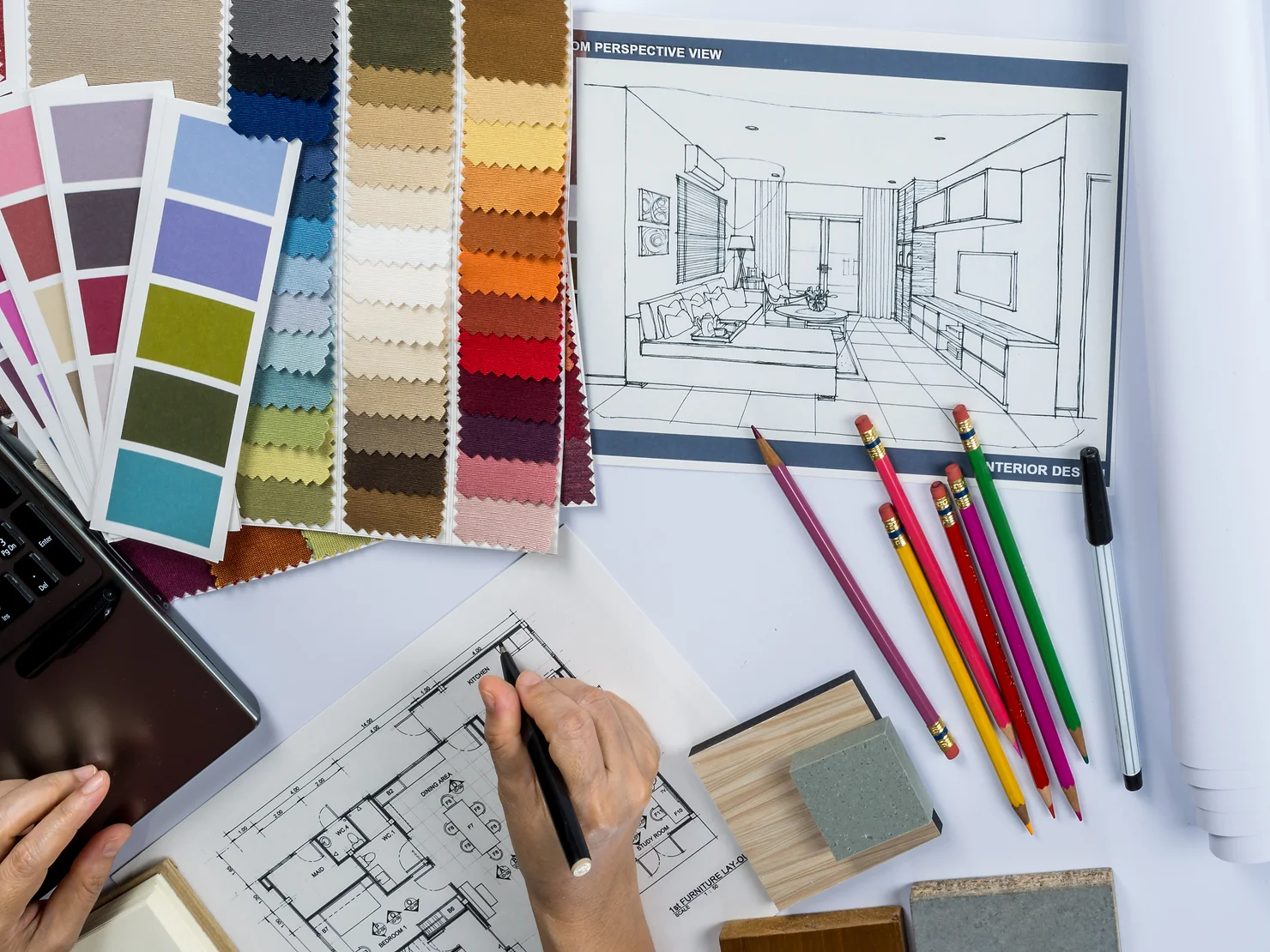
Warm color palettes do more than fill a room—they shift its energy. They draw you in, set a tone, and linger. That’s why designers often use warm colors in interiors to make a room feel alive, intimate, and full of intention. Their presence connects us to something instinctive, but their impact isn’t just visual—it also shapes how we move through and respond.
Why Warm Colors in Interiors Work Emotionally
Warm colors evoke feelings tied to basic human instincts, speaking to us on a level we rarely even notice. Red grabs our attention like a flashing signal—it’s a leftover instinct from our ancestors who needed to respond to danger or ripe food in the wild. Orange feels like a fire or the last light of a setting sun. Yellow lifts the mood, in a way that sunlight breaking through the clouds makes a cold day feel alive. Beyond simply reminding us of nature, they connect us to our primal. The feeling is reassuring because we’ve experienced it time and time again.
These associations stem from biology as much as from cultural symbolism, which is why they feel so universally comforting. Combined, warm colors mimic natural phenomena—sunsets, autumn leaves, or a crackling fire—playing a meaningful role in the psychology of interior design.
When designers combine warm colors in interiors, they tap into emotional memory. The best layouts don’t just look good—they make you feel something. And balance is, of course, crucial.
Basic Warm Colors in Interior Design
We will focus on the basic warm colors in interiors today, but expect a more detailed approach to different shades and how to use them in our following articles.
Red. Bold Intensity.
Red occupies a unique space in the color spectrum, as it is simultaneously energizing and emotionally charged. Its stimulating effects have been identified in both biology and psychology and well-documented, including proofs of heighten physical reactions or boosted heart rates and adrenaline levels. This fierce response is likely due to its association with survival cues like fire and blood.
Moreover, studies focused specifically on the effect of red on performance (Elliot & Maier, 2007) found that background features in this color can also influence motivation without one’s conscious awareness.
Such vigor makes the red at the same time a powerful tool and a potential pitfall in interior design. Probably the most widespread notion about this color is its power to enhance appetite and stimulate conversation—a phenomenon so reliable that many successful restaurants employ it for the purpose. Particularly fast food joints.
Despite its commercial applications, in home interiors red is best used with restraint. Also, it requires tactics. Painting one wall in deep crimson can convey a sense of intimacy in the room but pairing it with neutral furniture like cream or beige will prevent visual fatigue. Red accents—scarlet cushions on a gray sofa or a cherry-red lamp in an otherwise muted room—are the easiest way to infuse more energy without dominating the interior.
In other spaces (think bedrooms or offices), red requires even more consideration. You will rarely find it as the dominant color in relaxation areas. A muted tone like brick or maroon is not a bad choice for a study nook, where focus is a priority yet brighter reds might overstimulate and distract.
Typically (and unless you are going for a monochrome on an intentionally intense look), red should occupy no more than 10–20% of a room’s visual space. Balancing it with cooler tones like slate gray or soft blues will keep the energy contained.
Happy Yellow
Yellow captures light. It’s long been associated with optimism, thus often used to mimic sunlight’s uplifting effect. In terms of applying warm colors in interiors, yellow’s ability to enhance focus makes it particularly suitable for kitchens, offices, hallways—or, in general, areas where cognitive activity is required. Studies on color temperature confirm that yellow can improve performance, but only in controlled doses. Similarly to red, prolonged exposure to brighter, fierce tones of yellow may cause overstimulation and/or irritability. The impact is more pronounced in small or enclosed spaces.
Why does this happen? Due to yellow’s position in the high-energy end of the visible spectrum, its brightness can strain the eyes. However, it takes much longer for small doses of pastel yellow to provoke such effect compared to high-intensity shades like lemon or chartreuse used excessively.
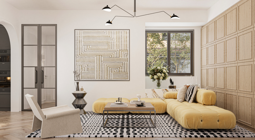
That’s why designers turn to softer hues like butter or wheat to carry through the desired psychological benefits. Pale yellow cabinetry in a small kitchen can still render a sunlit atmosphere, especially if combined with warm wood countertops and white walls. It’s possible to dedicate even up to 50–60% of a room’s palette to yellow in these cases, layering in darker woods or metallic finishes like brass to ground the space. Soft lavender and similar complementary hues might appear in vases, cushions, or patterned rugs, tempering the brightness further. This interplay aligns with complementary color theory, where opposites on the wheel balance each other’s extremes.
Creative Orange
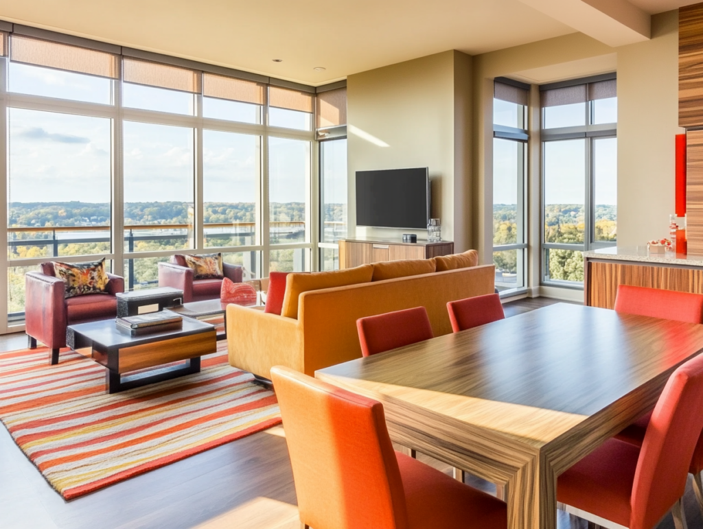
Now, what about the middle ground? Orange derives its psychological effects from its position between red and yellow on the color wheel. These effects—documented in studies—suggest it fosters feelings of enthusiasm, heightened activity, and emotional ardency. Orange is often referred to as a creative color that thrives in social spaces. That makes it especially effective in living rooms or playrooms, where energy and connection matter most.
Once again, that doesn’t mean you need to go with the intense basic orange. Take terracotta as an example. This muted, earthy orange tone has grown increasingly popular in modern and rustic interiors. It works well even in substantial pieces—such as an upholstered sectional or a bold oversized rug—especially when layered with neutrals like taupe or greige (gray-beige). A terracotta couch can be offset by dark teal or navy curtains: this pairing works due to the color wheel theory, where blue and orange are complementary colors.
On the other hand, when used in children’s spaces or playrooms, bright oranges like tangerine or carrot encourage creativity. The same applies to all spaces that can benefit from a spark of inspiration, such as art studios.
How Warm Colors in Interiors Work Together
Warm colors, when paired thoughtfully, create spaces that feel alive, emotionally rich. It’s not uncommon for designers to build warm schemes using analogous colors: those that sit next to each other on the color wheel, just like red, orange, and yellow do. They blend naturally, so it’s possible to avoid jarring contrasts but still maintain the desired flow. However, the success of such palettes depends on the balance of the intensities of each shade as well as cooler or neutral tones added to soften the effect.
Can You Use Red, Orange, and Yellow Together?
A combination of red, orange, and yellow can feel like a warm sunset—each color brings its own personality to the equation. Still, in order to prevent chaos, one color must take the lead while the others play supporting roles.
Proportion is the keyword here. Orange might dominate 50% of the room’s palette, yellow could account for 30%, and red would make up just 10%. This hierarchy ensures that the colors complement rather than compete with one another.
Balancing With Cool or Neutral Colors
White, cream, beige, grey, and even black serve as a neutral buffer. They give warm colors in interiors the room to breathe, at the same time helping them stand out and make a stronger impact. Used sparingly, black can also sharpen the edges of a warm palette, lending it a contemporary look.
Cool colors, like teal or deep blue, bring an entirely different energy. Sitting opposite orange on the color wheel, they temper its heat without stealing its spotlight. In a room with rust-orange walls, adding a teal vase on a wooden shelf or a navy pillow on a mustard armchair creates a contrast that feels natural, not forced.
Wrapping Up
Warm colors have a way of turning interiors into spaces that feel alive, shaping moods as much as aesthetics. If you’re curious to learn more about colors in interiors, move on to our next articles, which explore their transformative potential further. Or, if you’re ready for remodeling, reach out and start designing a space that feels as vivacious as you are.
Warm color palettes do more than fill a room—they shift its energy. They draw you in, set a tone, and linger. That’s why designers often use warm colors in interiors to make a room feel alive, intimate, and full of intention. Their presence connects us to something instinctive, but their impact isn’t just visual—it also shapes how we move through and respond.
Why Warm Colors in Interiors Work Emotionally
Warm colors evoke feelings tied to basic human instincts, speaking to us on a level we rarely even notice. Red grabs our attention like a flashing signal—it’s a leftover instinct from our ancestors who needed to respond to danger or ripe food in the wild. Orange feels like a fire or the last light of a setting sun. Yellow lifts the mood, in a way that sunlight breaking through the clouds makes a cold day feel alive. Beyond simply reminding us of nature, they connect us to our primal. The feeling is reassuring because we’ve experienced it time and time again.
These associations stem from biology as much as from cultural symbolism, which is why they feel so universally comforting. Combined, warm colors mimic natural phenomena—sunsets, autumn leaves, or a crackling fire—playing a meaningful role in the psychology of interior design.
When designers combine warm colors in interiors, they tap into emotional memory. The best layouts don’t just look good—they make you feel something. And balance is, of course, crucial.
Basic Warm Colors in Interior Design
We will focus on the basic warm colors in interiors today, but expect a more detailed approach to different shades and how to use them in our following articles.
Red. Bold Intensity.
Red occupies a unique space in the color spectrum, as it is simultaneously energizing and emotionally charged. Its stimulating effects have been identified in both biology and psychology and well-documented, including proofs of heighten physical reactions or boosted heart rates and adrenaline levels. This fierce response is likely due to its association with survival cues like fire and blood.
Moreover, studies focused specifically on the effect of red on performance (Elliot & Maier, 2007) found that background features in this color can also influence motivation without one’s conscious awareness.
Such vigor makes the red at the same time a powerful tool and a potential pitfall in interior design. Probably the most widespread notion about this color is its power to enhance appetite and stimulate conversation—a phenomenon so reliable that many successful restaurants employ it for the purpose. Particularly fast food joints.
Despite its commercial applications, in home interiors red is best used with restraint. Also, it requires tactics. Painting one wall in deep crimson can convey a sense of intimacy in the room but pairing it with neutral furniture like cream or beige will prevent visual fatigue. Red accents—scarlet cushions on a gray sofa or a cherry-red lamp in an otherwise muted room—are the easiest way to infuse more energy without dominating the interior.
In other spaces (think bedrooms or offices), red requires even more consideration. You will rarely find it as the dominant color in relaxation areas. A muted tone like brick or maroon is not a bad choice for a study nook, where focus is a priority yet brighter reds might overstimulate and distract.
Typically (and unless you are going for a monochrome on an intentionally intense look), red should occupy no more than 10–20% of a room’s visual space. Balancing it with cooler tones like slate gray or soft blues will keep the energy contained.
Happy Yellow
Yellow captures light. It’s long been associated with optimism, thus often used to mimic sunlight’s uplifting effect. In terms of applying warm colors in interiors, yellow’s ability to enhance focus makes it particularly suitable for kitchens, offices, hallways—or, in general, areas where cognitive activity is required. Studies on color temperature confirm that yellow can improve performance, but only in controlled doses. Similarly to red, prolonged exposure to brighter, fierce tones of yellow may cause overstimulation and/or irritability. The impact is more pronounced in small or enclosed spaces.
Why does this happen? Due to yellow’s position in the high-energy end of the visible spectrum, its brightness can strain the eyes. However, it takes much longer for small doses of pastel yellow to provoke such effect compared to high-intensity shades like lemon or chartreuse used excessively.
That’s why designers turn to softer hues like butter or wheat to carry through the desired psychological benefits. Pale yellow cabinetry in a small kitchen can still render a sunlit atmosphere, especially if combined with warm wood countertops and white walls. It’s possible to dedicate even up to 50–60% of a room’s palette to yellow in these cases, layering in darker woods or metallic finishes like brass to ground the space. Soft lavender and similar complementary hues might appear in vases, cushions, or patterned rugs, tempering the brightness further. This interplay aligns with complementary color theory, where opposites on the wheel balance each other’s extremes.
Creative Orange
Now, what about the middle ground? Orange derives its psychological effects from its position between red and yellow on the color wheel. These effects—documented in studies—suggest it fosters feelings of enthusiasm, heightened activity, and emotional ardency. Orange is often referred to as a creative color that thrives in social spaces. That makes it especially effective in living rooms or playrooms, where energy and connection matter most.
Once again, that doesn’t mean you need to go with the intense basic orange. Take terracotta as an example. This muted, earthy orange tone has grown increasingly popular in modern and rustic interiors. It works well even in substantial pieces—such as an upholstered sectional or a bold oversized rug—especially when layered with neutrals like taupe or greige (gray-beige). A terracotta couch can be offset by dark teal or navy curtains: this pairing works due to the color wheel theory, where blue and orange are complementary colors.
On the other hand, when used in children’s spaces or playrooms, bright oranges like tangerine or carrot encourage creativity. The same applies to all spaces that can benefit from a spark of inspiration, such as art studios.
How Warm Colors in Interiors Work Together
Warm colors, when paired thoughtfully, create spaces that feel alive, emotionally rich. It’s not uncommon for designers to build warm schemes using analogous colors: those that sit next to each other on the color wheel, just like red, orange, and yellow do. They blend naturally, so it’s possible to avoid jarring contrasts but still maintain the desired flow. However, the success of such palettes depends on the balance of the intensities of each shade as well as cooler or neutral tones added to soften the effect.
Can You Use Red, Orange, and Yellow Together?
A combination of red, orange, and yellow can feel like a warm sunset—each color brings its own personality to the equation. Still, in order to prevent chaos, one color must take the lead while the others play supporting roles.
Proportion is the keyword here. Orange might dominate 50% of the room’s palette, yellow could account for 30%, and red would make up just 10%. This hierarchy ensures that the colors complement rather than compete with one another.
Balancing With Cool or Neutral Colors
White, cream, beige, grey, and even black serve as a neutral buffer. They give warm colors in interiors the room to breathe, at the same time helping them stand out and make a stronger impact. Used sparingly, black can also sharpen the edges of a warm palette, lending it a contemporary look.
Cool colors, like teal or deep blue, bring an entirely different energy. Sitting opposite orange on the color wheel, they temper its heat without stealing its spotlight. In a room with rust-orange walls, adding a teal vase on a wooden shelf or a navy pillow on a mustard armchair creates a contrast that feels natural, not forced.
Wrapping Up
Warm colors have a way of turning interiors into spaces that feel alive, shaping moods as much as aesthetics. If you’re curious to learn more about colors in interiors, move on to our next articles, which explore their transformative potential further. Or, if you’re ready for remodeling, reach out and start designing a space that feels as vivacious as you are.