Cool color palettes do more than quiet a room. They shape its atmosphere, expand space, slow the pace, and settle the air. Their impact isn’t just about how they look—it’s about how they let you feel. That’s why designers often turn to cool colors in interiors when they aim for a serene, open, and thoughtfully composed room.
Why Cool Colors in Interiors Work Emotionally
The pull of these colors isn’t just aesthetic. Cool colors in interiors (and in general) connect us to a different side of nature, calm waters, open skies, and shaded forests. Unlike others that rush or overwhelm, they call for a pause. Blue, for instance, soothes the nervous system, slows the pulse, and opens the mind—qualities rooted in biology as much as in experience. It signals open, safe spaces, while green connects us to the energy of life itself. Green also reminds us of places where we’ve felt refreshed. Purple, meanwhile, bears a flair of mystery that spices up the everyday.
These links are reinforced by cultural associations: blue is the color of clarity, green of harmony, and purple of creativity.
Cool tones in interior design also change how we perceive the room itself. They visually recede, making spaces feel more expansive, while diffusing light in ways that soften edges and create subtle transitions.
And the psychology of interior design relies on and exploits all those attributes.
All Shades of Blue
Probably the most beloved of all cool colors in interiors, blue has the reputation of alleviating the body and mind. Its calming influence is well-documented in color psychology, often associated with trust, stability, and serenity—qualities linked to its representation of the sky and water. According to studies published in The Journal of Applied Color Psychology, it reduces blood pressure and heart rate. Psychologists also say blue helps us feel more centered, which is the reason we naturally gravitate toward it when we need to unwind.
Beyond the established notions, not all blues work the same way. Most light blues feel pleasantly fresh. And then there are all those darker shades that carry a different weight, deeper and more serious.
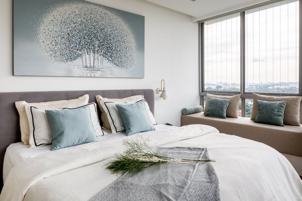
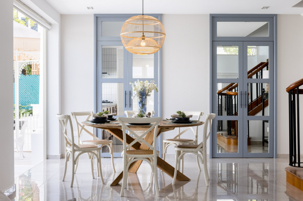
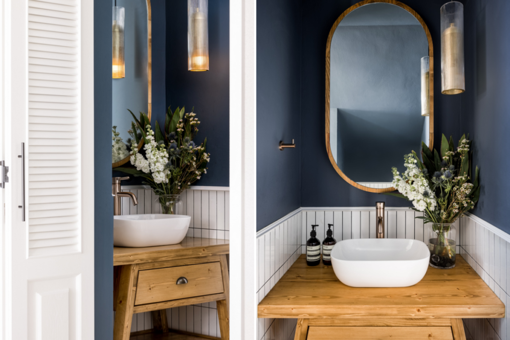
Like all other cool and warm colors in interiors, blue is dependable. For example, light blue walls in a bedroom work particularly well when paired with white bedding and curtains, reinforcing that fresh, open feel. Meanwhile, navy walls do most of their magic in moody home offices or libraries—they render a space where you want to sit, focus, and linger.
Some research (Mehta & Zhu, 2009.) support the belief that blue can pair with red in terms of inducing motivation, except that red proved more influential in detail-oriented tasks while blue excelled in creative ones.
Blue can also shift depending on how it’s used. Many find a pale blue bathroom uplifting in the morning light; however, in a dim hallway, that same shade could turn displeasing. Knowing this, designers tactically layer this shade with textures or warm tones to keep its energy balanced.
Green That Grounds and Restores
Green feels alive, like a bridge between the indoors and outdoors. It’s the shade of growth, the one we associate with renewal or places that breathe—forests, meadows, even a garden after rain. Brought as one of the cool colors in interiors, it has a calming weight that helps settle a space. Where blue floats and chills, green holds its ground: it doesn’t rush you; it lets the room unfold slowly.
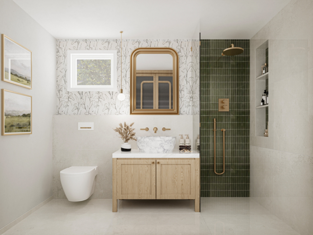
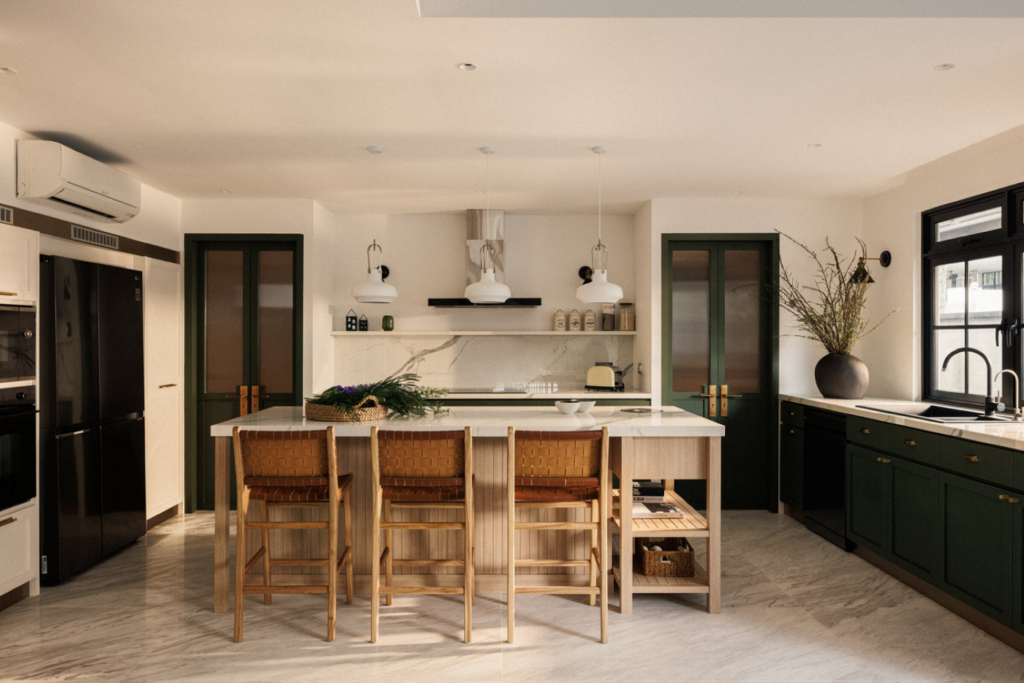
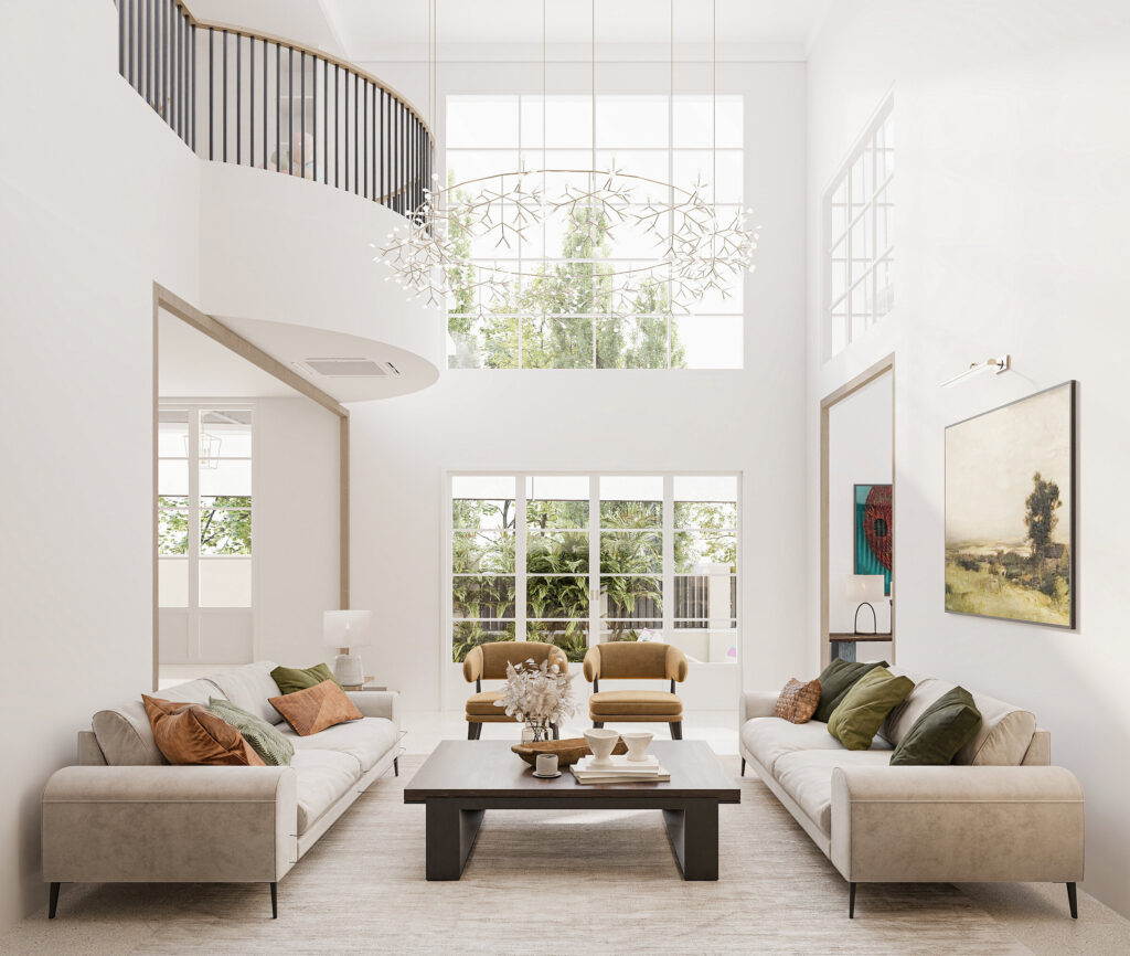
In living rooms, green acts as a connector. A sage-green sofa bridges the gap between neutral walls and bolder accents; it has enough presence to stand on its own, and enough subtlety to let other colors shine. Emerald or forest greens, by contrast, make excellent focal points—an accent wall behind a bookcase, for instance, or a set of green velvet chairs in an otherwise light-toned room. Deep olive walls in a dining room affect how we perceive its intimacy: one of those elusive vibes that encourage people to linger at the table. They draw your focus inward, making large spaces feel closer-knit and small spaces more intentional.
Deep greens also profoundly affect the room’s style, especially when brought in through tactile surfaces—think velvet or marble. Lime or chartreuse work in different ways, often conveying playful energy. But despite all assets, green can still overwhelm a room if piled up without a plan.
The most remarkable thing about green is (arguably) how easily it adjusts. Put it next to natural wood, and it feels earthy. But add a few brass accents, and suddenly the whole arrangement appears far more sophisticated. Depending on the application, stone or concrete might then turn it into contemporary cool. In simple words, green doesn’t demand to be the center of attention—it adapts, wherever placed.
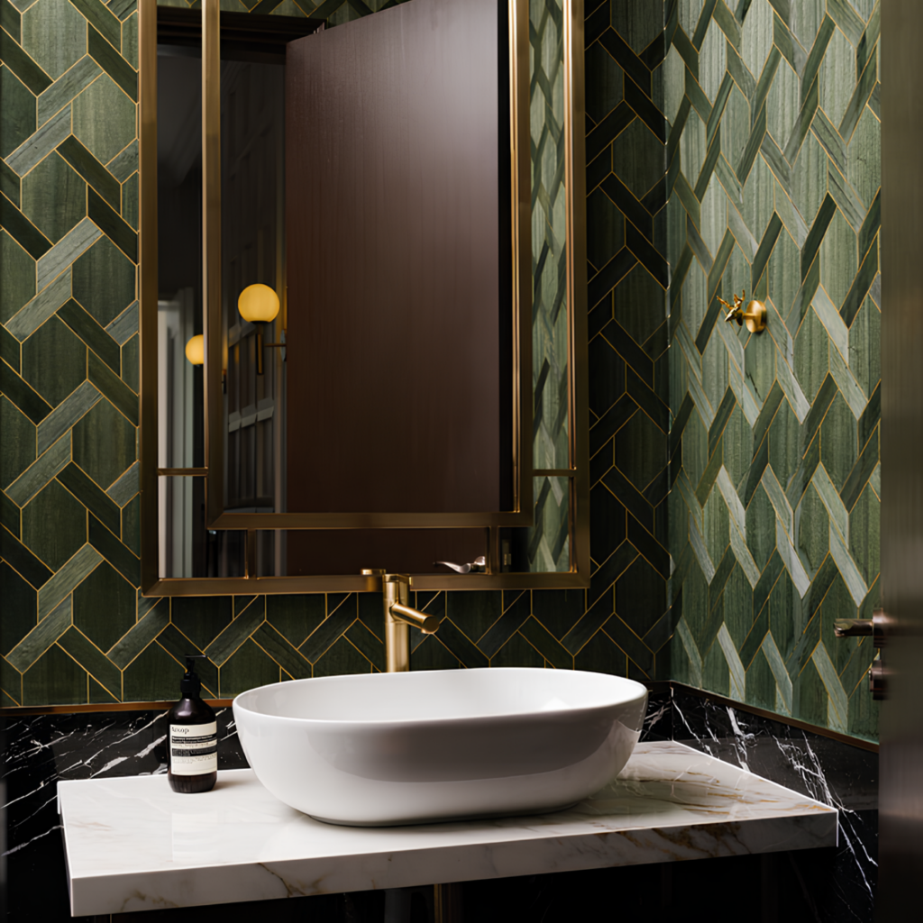
Purple, the Most Intriguing Among Cool Colors in Interiors
Purple stands halfway between fire and ice as a mix of red’s energy with blue’s calm. Its perceived connection to opulence comes from its historical scarceness and the times it was one of the most expensive dyes to produce. This color was once reserved for royalty and some of that flair, together with a certain mystique, still lingers. If you are skeptical, pair purple with brass or gold accents today, and watch how it renders a contemporary (yes, even minimalist) interior that feels luxurious without trying too hard.
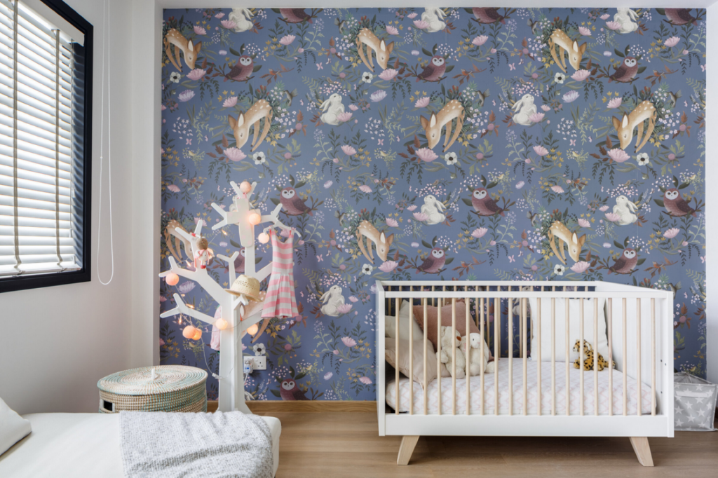
As one of the three basic cool colors in interiors, purple works best in spaces where people reflect or want to feel inspired. Psychologists suggest that its dual nature makes it a color that invites introspection. But its psychological impact is complex. Lighter hues, lavender or lilac, are often associated with romance. These softer tones work particularly well in bedrooms or meditative spaces, where they encourage relaxation. Plum or eggplant, on the other hand, feel dramatic and moody and carry a substantial visual weight. They draw a room inward, condensing its energy.
Due to its strength, purple can be polarizing. For every person who feels inspired by its depth, there’s another who finds it too dramatic, too heavy. Also, too much of it—especially darker tones—can subjugate the rest of the layout. This is why interior designers often treat purple as a feature rather than a base color and balance it with softer neutrals to keep the room approachable. You will mostly find it in upholstery, drapery, or accent walls, occupying up to 30% (more often 15% or less) of the room.
How Cool Tones in Interiors Work Together
Cool colors in interiors naturally harmonise with one another. However, their subtle differences in tone and temperature allow designers to experiment with layering to achieve various contrasts or complexity.
When cool tones are used together, they create what’s known as an analogous palette drawn from adjacent colors on the wheel. For example, a room might contain a green wall, muted lavender curtains, and pale blue furnishings. The colors transition naturally, unlike the sharp contrasts of complementary schemes.
Can You Use Blue, Green, and Purple in a Single Room?
Absolutely, but the success of combining cool colors in interiors that way depends on proportion, contrast, and context. Blended thoughtfully, blues, greens, and purples create fluid spaces where each color enhances the next.
Designers often follow the dominant-subordinate-accent ratio—better known as the 60-30-10 rule—when working with multiple tones. In terms of cool colors in interiors, 60% of the room could be a soft blue on the walls, 30% would be reserved for a secondary tone (say, sage green) in the furniture, and 10% might come from purple art and accents.
Gradient shading works well here, plus, even though cool tones are similar, it’s possible to create strong contrasts with patterns and textures. The differences in saturation keep the layout lively, while the shared cool undertones make the room feel unified.
Wrapping Up
Refreshing our connection with the interiors we inhabit is one of the main psychological benefits of home remodeling. Cool colors in interiors are most successful in spaces designed for calm or focus, like bedrooms, offices, and bathrooms. Layering cool tones can still work in rooms meant for gatherings, such as living or dining spaces, but often requires offsetting with neutral elements, brass light fixtures, or warm-toned wood floors to keep the space from feeling sterile.
In our next articles, we will focus on trendy interior colors, such as neutral and earthy schemes, so stay tuned.
Cool color palettes do more than quiet a room. They shape its atmosphere, expand space, slow the pace, and settle the air. Their impact isn’t just about how they look—it’s about how they let you feel. That’s why designers often turn to cool colors in interiors when they aim for a serene, open, and thoughtfully composed room.
Why Cool Colors in Interiors Work Emotionally
The pull of these colors isn’t just aesthetic. Cool colors in interiors (and in general) connect us to a different side of nature, calm waters, open skies, and shaded forests. Unlike others that rush or overwhelm, they call for a pause. Blue, for instance, soothes the nervous system, slows the pulse, and opens the mind—qualities rooted in biology as much as in experience. It signals open, safe spaces, while green connects us to the energy of life itself. Green also reminds us of places where we’ve felt refreshed. Purple, meanwhile, bears a flair of mystery that spices up the everyday.
These links are reinforced by cultural associations: blue is the color of clarity, green of harmony, and purple of creativity.
Cool tones in interior design also change how we perceive the room itself. They visually recede, making spaces feel more expansive, while diffusing light in ways that soften edges and create subtle transitions.
And the psychology of interior design relies on and exploits all those attributes.
All Shades of Blue
Probably the most beloved of all cool colors in interiors, blue has the reputation of alleviating the body and mind. Its calming influence is well-documented in color psychology, often associated with trust, stability, and serenity—qualities linked to its representation of the sky and water. According to studies published in The Journal of Applied Color Psychology, it reduces blood pressure and heart rate. Psychologists also say blue helps us feel more centered, which is the reason we naturally gravitate toward it when we need to unwind.
Beyond the established notions, not all blues work the same way. Most light blues feel pleasantly fresh. And then there are all those darker shades that carry a different weight, deeper and more serious.
Like all other cool and warm colors in interiors, blue is dependable. For example, light blue walls in a bedroom work particularly well when paired with white bedding and curtains, reinforcing that fresh, open feel. Meanwhile, navy walls do most of their magic in moody home offices or libraries—they render a space where you want to sit, focus, and linger.
Some research (Mehta & Zhu, 2009.) support the belief that blue can pair with red in terms of inducing motivation, except that red proved more influential in detail-oriented tasks while blue excelled in creative ones.
Blue can also shift depending on how it’s used. Many find a pale blue bathroom uplifting in the morning light; however, in a dim hallway, that same shade could turn displeasing. Knowing this, designers tactically layer this shade with textures or warm tones to keep its energy balanced.
Green That Grounds and Restores
Green feels alive, like a bridge between the indoors and outdoors. It’s the shade of growth, the one we associate with renewal or places that breathe—forests, meadows, even a garden after rain. Brought as one of the cool colors in interiors, it has a calming weight that helps settle a space. Where blue floats and chills, green holds its ground: it doesn’t rush you; it lets the room unfold slowly.
In living rooms, green acts as a connector. A sage-green sofa bridges the gap between neutral walls and bolder accents; it has enough presence to stand on its own, and enough subtlety to let other colors shine. Emerald or forest greens, by contrast, make excellent focal points—an accent wall behind a bookcase, for instance, or a set of green velvet chairs in an otherwise light-toned room. Deep olive walls in a dining room affect how we perceive its intimacy: one of those elusive vibes that encourage people to linger at the table. They draw your focus inward, making large spaces feel closer-knit and small spaces more intentional.
Deep greens also profoundly affect the room’s style, especially when brought in through tactile surfaces—think velvet or marble. Lime or chartreuse work in different ways, often conveying playful energy. But despite all assets, green can still overwhelm a room if piled up without a plan.
The most remarkable thing about green is (arguably) how easily it adjusts. Put it next to natural wood, and it feels earthy. But add a few brass accents, and suddenly the whole arrangement appears far more sophisticated. Depending on the application, stone or concrete might then turn it into contemporary cool. In simple words, green doesn’t demand to be the center of attention—it adapts, wherever placed.
Purple, the Most Intriguing Among Cool Colors in Interiors
Purple stands halfway between fire and ice as a mix of red’s energy with blue’s calm. Its perceived connection to opulence comes from its historical scarceness and the times it was one of the most expensive dyes to produce. This color was once reserved for royalty and some of that flair, together with a certain mystique, still lingers. If you are skeptical, pair purple with brass or gold accents today, and watch how it renders a contemporary (yes, even minimalist) interior that feels luxurious without trying too hard.
As one of the three basic cool colors in interiors, purple works best in spaces where people reflect or want to feel inspired. Psychologists suggest that its dual nature makes it a color that invites introspection. But its psychological impact is complex. Lighter hues, lavender or lilac, are often associated with romance. These softer tones work particularly well in bedrooms or meditative spaces, where they encourage relaxation. Plum or eggplant, on the other hand, feel dramatic and moody and carry a substantial visual weight. They draw a room inward, condensing its energy.
Due to its strength, purple can be polarizing. For every person who feels inspired by its depth, there’s another who finds it too dramatic, too heavy. Also, too much of it—especially darker tones—can subjugate the rest of the layout. This is why interior designers often treat purple as a feature rather than a base color and balance it with softer neutrals to keep the room approachable. You will mostly find it in upholstery, drapery, or accent walls, occupying up to 30% (more often 15% or less) of the room.
How Cool Tones in Interiors Work Together
Cool colors in interiors naturally harmonise with one another. However, their subtle differences in tone and temperature allow designers to experiment with layering to achieve various contrasts or complexity.
When cool tones are used together, they create what’s known as an analogous palette drawn from adjacent colors on the wheel. For example, a room might contain a green wall, muted lavender curtains, and pale blue furnishings. The colors transition naturally, unlike the sharp contrasts of complementary schemes.
Can You Use Blue, Green, and Purple in a Single Room?
Absolutely, but the success of combining cool colors in interiors that way depends on proportion, contrast, and context. Blended thoughtfully, blues, greens, and purples create fluid spaces where each color enhances the next.
Designers often follow the dominant-subordinate-accent ratio—better known as the 60-30-10 rule—when working with multiple tones. In terms of cool colors in interiors, 60% of the room could be a soft blue on the walls, 30% would be reserved for a secondary tone (say, sage green) in the furniture, and 10% might come from purple art and accents.
Gradient shading works well here, plus, even though cool tones are similar, it’s possible to create strong contrasts with patterns and textures. The differences in saturation keep the layout lively, while the shared cool undertones make the room feel unified.
Wrapping Up
Refreshing our connection with the interiors we inhabit is one of the main psychological benefits of home remodeling. Cool colors in interiors are most successful in spaces designed for calm or focus, like bedrooms, offices, and bathrooms. Layering cool tones can still work in rooms meant for gatherings, such as living or dining spaces, but often requires offsetting with neutral elements, brass light fixtures, or warm-toned wood floors to keep the space from feeling sterile.
In our next articles, we will focus on trendy interior colors, such as neutral and earthy schemes, so stay tuned.